|
|
|
Mitch Mason Offers a Different Take on the Classic Field Watch with the Chronicle |
|
|
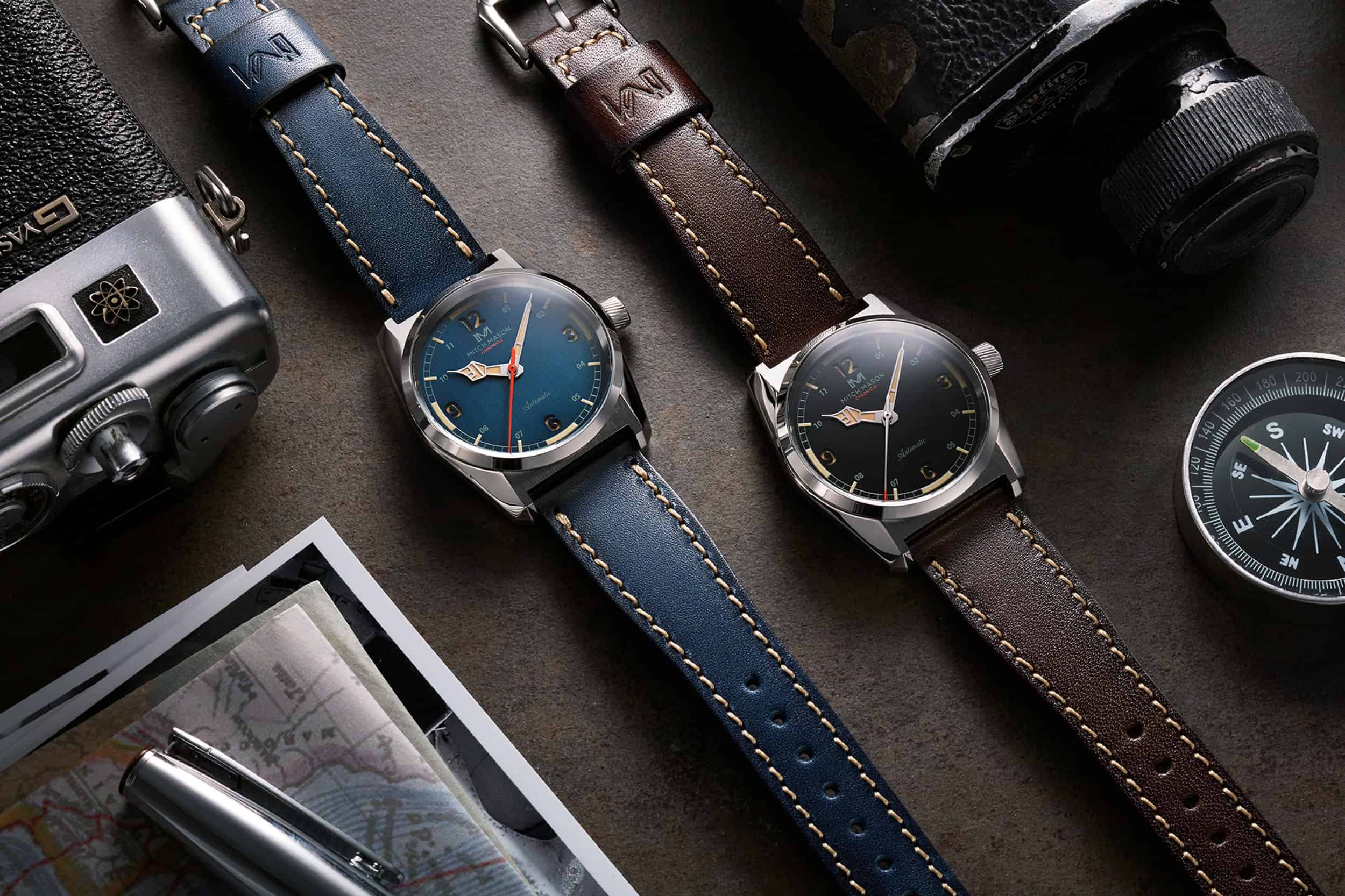
Mitch Mason is a new watch brand, and like many others is looking to get their start through a crowdfunding campaign, which launches September 1. Their first watch, the Chronicle, is a take on the classic field watch, increasingly a genre new watch brands are comfortable starting out in. Besides the dive watch, the field watch is perhaps the most well understood, versatile type of sports watch. There?s a certain ease in designing a field watch – the basic template has remained unchanged for decades. But there?s a challenge on the flip side of that equation: how do you stand out from the crowd" For Mitch Mason, the answer seems to be a funky case design, a variety of color choices, and a handset that?s not at all what you?d expect on a field watch.
Let?s start with the case, as it?s the least ?field watch? thing about the Chronicle, in my opinion. A field watch, the many varieties of which Ed Jelley covered in a guide back in April, tends to have a rigorously simple design. A circular case without a lot of ornamentation or decoration. The Chronicle?s case is highly angular with several distinct facets. I?m reminded of Seiko and Grand Seiko designs and their intersecting, zaratsu polished edges. The Chronicle has a squared off appearance that?s much more common to the strange sports watches of the 70s than the tried and true field watch.
Not a typical field watch case
It?s the case?s dimensions that really tie it to field watch traditions. Measuring just 36.5mm in diameter, the Chronicle is right in line with vintage field watches and contemporary expressions of the genre like offerings from Hamilton, Oak & Oscar, and many others that come in at around 38mm or a little less. With a thickness of 12mm, the Chronicle, on paper, is a bit thick, but the angled lugs should help it wear close to the wrist, keeping it out of the way, which is where a field watch belongs.
The dial design borrows from certain aspects of the field watch vernacular, and breaks new ground in others. Arabic numerals at every hour are easily visible against a matte dial in one of four colors (blue, black, sand, or grey). The numerals are larger at the cardinal positions, smaller everywhere else. At a glance, the Chronicle?s layout could be called Explorer-esque, but there?s more happening here and, for better or worse, doesn?t possess the simplicity of a classic Explorer, or a field watch with numerals of the same size, and thus an easier symmetry. There?s definitely some distinct visual interest here, but it?s one of those love-it or hate-it design choices that will have some excited, and lose others before they can take in the Chronicle?s other interesting details.
To my eye, the most interesting of those details is the handset, specifically the hour hand, which reminds me of the King in a chess set. The hands are generally well executed and make for a highly legible dial. As stated above, four color choices are available. The blue ...
|
|
|
|
articulo visto |
4 |
veces, esta semana |
Fuente de la noticia: wornandwound
Fecha de publicación: 27-08-2020 19:58
visto: 4 |
|
------------------------------------------------------------------------------------------------------------ |
Recommended Video section of our luxury watch videos - Watch More Videos in luxury watch videos |
Measuring 1/100th of a second with the Defy El Primero 21 by Zenith Watches |
|
|
|
|